What goes into designing an exhibition catalogue? Our graphic designer, Noelle Shuck, talks about some of the decisions we made for our newest creation.
When I started design development for the Emma Amos catalogue, I knew that the details would be important. Of course details are always important when talking about graphic design — details are what make the design — but this book felt a little different. Partly because of the recent death of the artist, partly because of the visual impact of the works featured in the exhibition and partly because this would be the first comprehensive retrospective of her work.
Type
We wanted to echo Emma Amos’ investment in race and identity by choosing a display and body typeface designed by BIPOC, and found inspiration through the National Museum of African American History and Culture(opens in new tab). Both main typefaces used in “Color Odyssey” were designed by Joshua Darden(opens in new tab), the first African American credited as a typeface designer. Freight Sans(opens in new tab), the body copy, features humanist letterforms, which give it a warm and friendly appearance, amplifying the essays written by friends, admirers and colleagues of Amos, found in the front section of the catalogue. It has a large x-height and open apertures which also makes it a great sans serif for setting body copy.
Omnes(opens in new tab), our display face, is a rounded sans-serif typeface, which likewise gives it a friendly demeanor. Images and personal accounts of Amos tell us she was a friendly and warm person, which we felt Omnes mirrored. We opted for a thin weight and a large size when used for added contrast to the body copy.
Color
The colors Amos used in her work range across the spectrum, usually bright, and often accompanied by fabrics. It was very difficult to decide on a set palette. Instead, I thought pulling colors from the works featured on each page into a color bar behind the page number would be a great way to incorporate Amos’ vast array of color choices into the design. Likewise, each title spread features a full color page pulling from works within the exhibition, a nod to the meaning of the exhibition’s title.
Amos was also a weaver, and we wanted to emphasize her use and creation of textiles by using details of her woven works in cropped strips throughout the book both in between lines of pull quotes as well as on title splash pages. We also bound in a ribbon marker as a nod to her textile work.
Cover
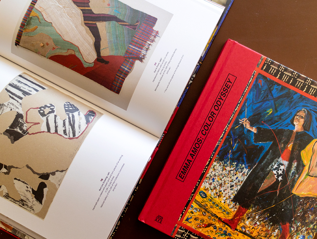
From the start we thought the cover would need to feature Amos’ self-portraits, as they were some of her most explicit investigations of color and identity. “Tightrope” had the added advantage of using fabric strips as edges, common in Amos’ later work.
Amos would sometimes print the title of the piece on the fabric border pieces of the works themselves. A three-piece-case cover format gave us the area we needed to set the title legibly and allowed us to mimic the way Amos applied the title “Tightrope” on her own work on the red border fabric. We chose a fabric texture emboss and a red cover paper to wrap the spine and set the title in the same Helvetica Bold Italic Amos used to title her works.
Endpages
We had so many wonderful images from the artist’s family that we decided the best way to feature them and give a sense of the life and personality of Emma Amos was to use them in a grid layout as the endpapers. As soon as you open the book, you see Emma, from her early life to her budding career and as a maturing master of her craft.
Want your own copy? You can pick one up here.
By Noelle Shuck